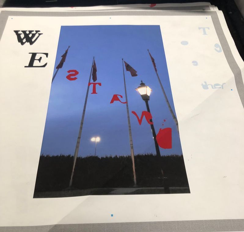
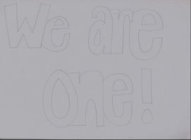
Together
36' by 36' mixed media |
The Exhibition
Both of my inspirations helped me layout and put together my final piece. While doing my research I found out that you could get a point across even in something so simple. I took both of my inspirations and put them together, but also put there own touch in each. I took these two pictures at way different times. I felt they both had significance and were important and could get my point across. I put both photos in photo shop blew them up and cleared them out. I wanted one to look older and classy that's why i went with the black and white look. Then I wanted the other to have more going on so you could pay attention to the words.
|
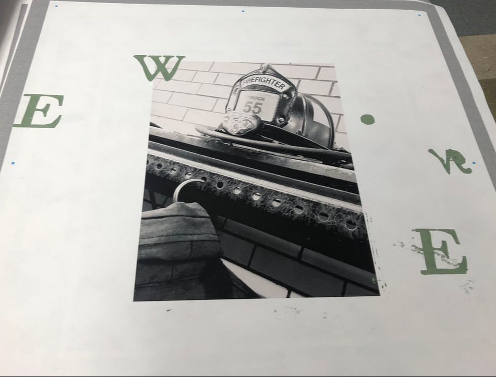
One1
36' by 36' mixed media |
inspiration
|
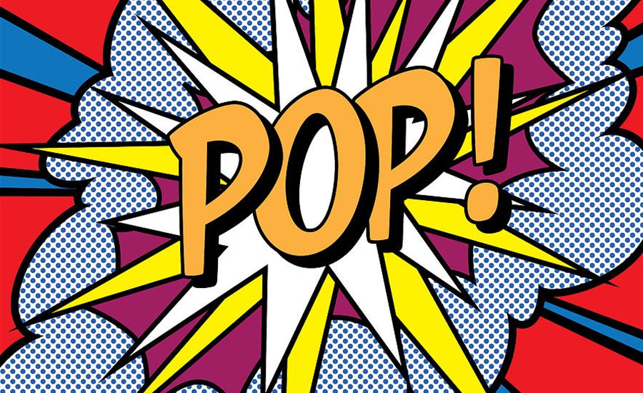
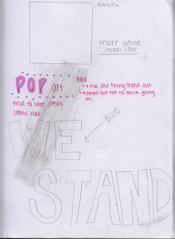
Andy Warhol:
Andy created pop art so that when you are looking at the art piece you can tell what the main message is. He also has different things going on in the background and uses cartoon or comic like lettering. So I choose to have pop art as a inspiration because I want someone to look at my piece and know what I am trying to say or what my point is without explanation. |
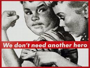
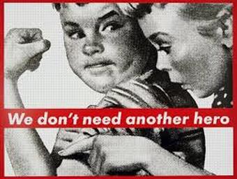
Barbara Kruger:
Barbara created a very unique are that I really like she photographed photos and put a message or a viewpoint she had and it was very simple yet a lot of meaning. I chose to make an art like hers, because I like how simple but so much meaning it can have by the words. I want my piece to be the same I want people to look and know what my point is and then the words conform it. |
planning
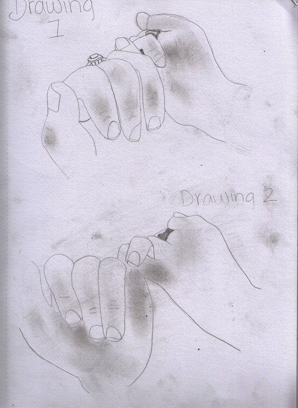
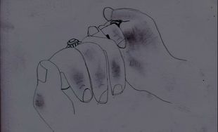
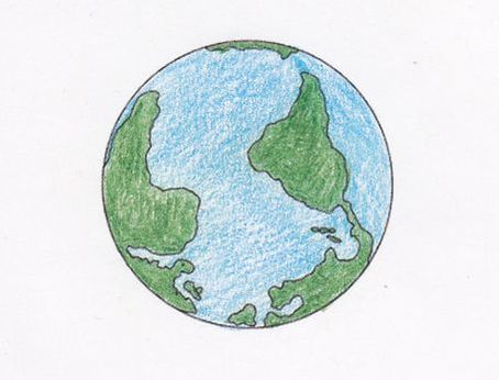
These are two ideas that I had in my head I wanted to use the color "Orange" so I used "yellow" and "red" to show create it. I picked orange because red symbolizes strength and being together or as one. Then yellow symbolizes joy and happiness. Which are all things community's should be about. That's what I wanted for the back ground and have "We stand together" in stencil. I am debating on putting the word "together or to have the two hand pinky promise symbolize together. Then my other planning was a boy looking up he would be the background not the whole background, because I want some white but most of it. He will be the center at the bottom with different skin tones. I want this to show we are all the same. At the bottom of the boy you see a heart mixed with three flags I am thinking about adding more flags to make it divers. Then have the heart in a thought bubble to make it look like that's what he is thinking/comprehend. The last touch would be in stencil and it would be words that say "We are one"
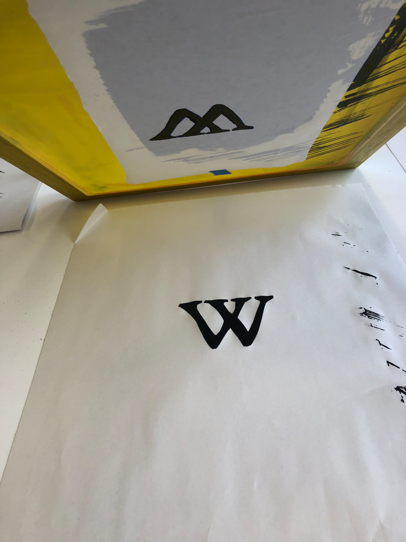
Stencils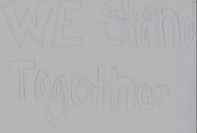
|
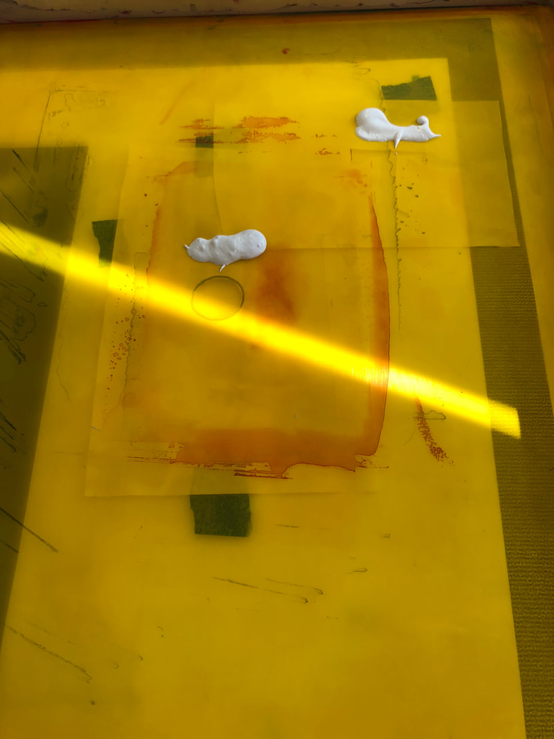
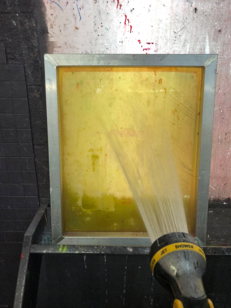
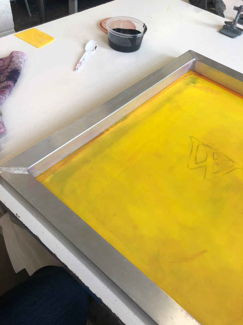
tips before/ set upWhen screen printing you want to make sure you move fast and have everything set up. Make sure you have a lot of working space.
You want to have all your materials ready to use for example you want to get your paint ready. Weather your going to mix colors to make a new one or use a plain color. After you have all of your materials you want to make sure you have a set up that you can move fast. process
|
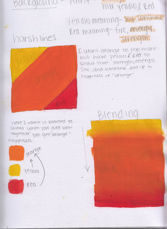
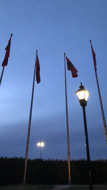
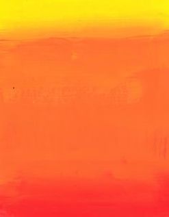
Background
|
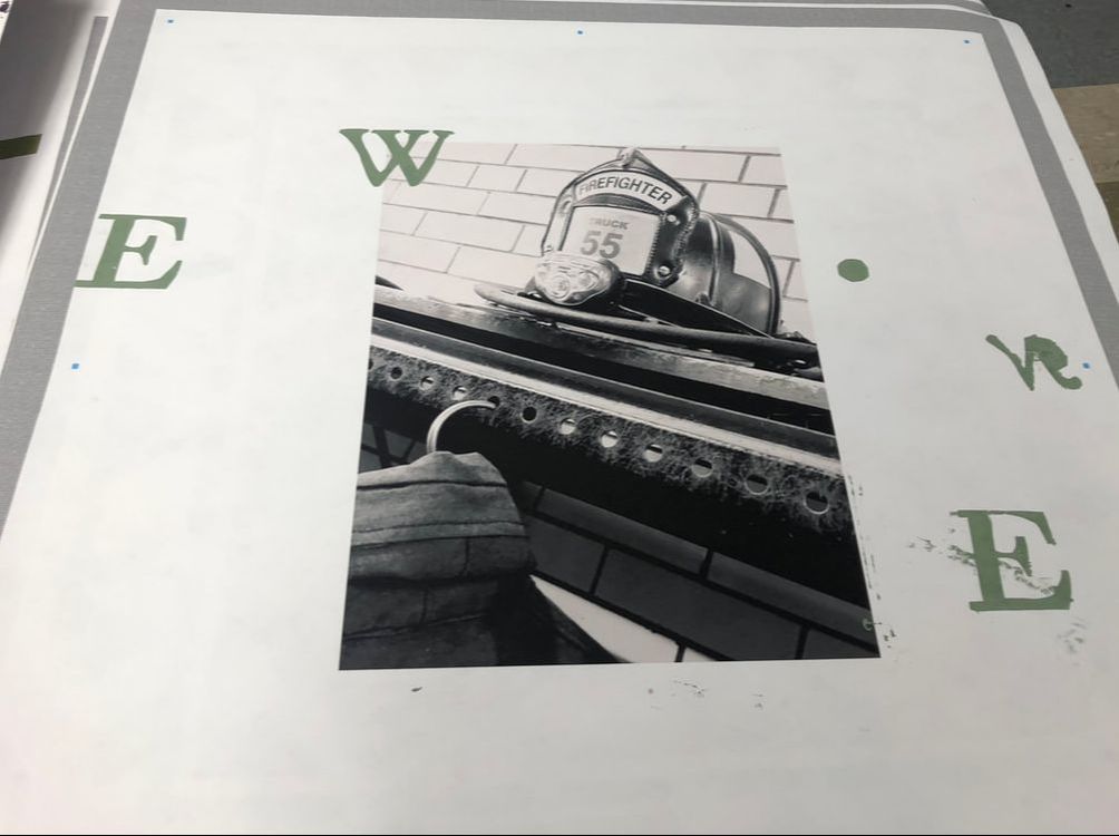
The backgrounds that were used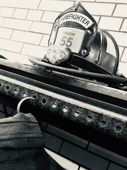
|
reflection |
EXPERIMENTATION |
|
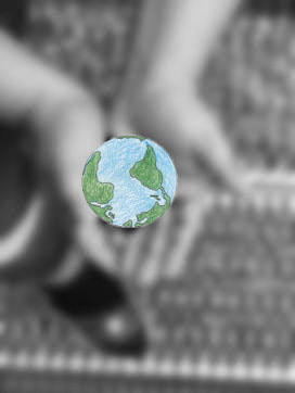
During this project I had a lot of down falls and I had to find different ways to go around it. One that delayed my chance in finishing earlier was my first two backgrounds which was the hands with earth, and the two pinky's promising. I couldn't go with these, because they became blurry when I tried to format them to 36 inches by 36 inches. Also when enlarging them they turned out blurry and couldn't present well on 200 resolution. A mistake that I made on my part was making my stencils small. The good thing was is the weekend before I took some really cool pictures in Chicago that I was able to connect and relate it to "Community". While we were at MIAD I did really well when we were practicing screen printing I did really well the lines were defined, nice and clean. Then when it got to actually putting it on my paper it was as clean or nice anymore. I think where I messed up was when i was changing my paper and getting things ready I let the ink dry so it wasn't as nice. I would really like to redo this project to make my stencils bigger and choose different backgrounds.
|
|
compare and contrast
compare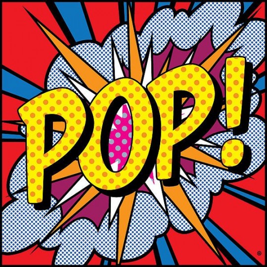
|
contrast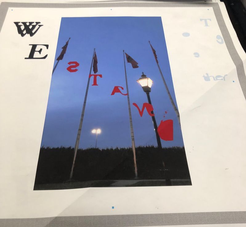
|
Act Questions:
Clearly explain how you are able to identify the cause effect relationship between your inspiration and its effect on your artwork?
Both of my inspirations helped me focus on a layout you could say to follow. I knew I wanted to follow the dark or black and white with color words like Barbara Kruger. Then I also knew I wanted to focus on something that stood out and grabbed you eye. So i tried to put both art pieces TOGETHER.
What is the overall approach the author has regarding the topic of your inspiration?
My central idea and theme was pop art and photographs.
What kind of generalizations and conclusions have you discovered about people, ideas, culture,etc. while you researched your inspiration?
while doing my research i REALIZED that you could have a way to approach something or a idea you want to get across. For example both Barbara Kruger and Andy Warhol wanted to have something simple with words involved, but still have a bigger meaning overall.
What is the central idea or theme around your inspirational research?
The central idea around both of my inspirations SOMETHING LITERAL yet there is a point oe message that is trying to get across to the readers.
What kind of inferences did you make while reading your research?
When reading i INFERRED that there are multiple ways to get a point across. Also you could do something so simple that you put a lot of work in, but still get a much bigger point across.
Sources
pop art |
photographed photos |
|
https://www.theartstory.org/movement-pop-art.htm
https://www.bbc.com/timelines/zwytpv4 https://study.com/academy/lesson/pop-art-lesson-for-kids-definition-facts.html |
http://www.barbarakruger.com/
https://www.smithsonianmag.com/arts-culture/barbara-krugers-artwork-speaks-truth-to-power-137717540/ https://www.britannica.com/biography/Barbara-Kruger |
